The ebook may seem to have taken the world by storm, but in fact, it has only been a storm in a few countries.
Outside the major Amazon Kindle markets such as the US, UK, and Germany, it has hardly been a rain squall.
I live in Switzerland, very close to France, and if I mention ebooks or the Kindle to my French-speaking friends, I may as well be talking about Martians landing on the Moon. “C’est quoi ça?”
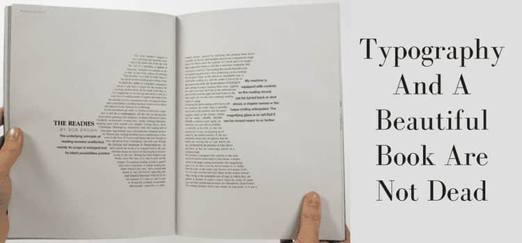
They all have an iPad, but almost no one I know has ever looked at the iBooks app, let alone installed the Kindle app. Why? Because books are books, and an ebook can never match the typography books offer.
Books are beautiful
The book is very much still alive and well in the French-speaking world, as it is in many other countries and language regions around the world. “But they don’t read in English,” I hear you say immediately. Wrong.
The Internet has made English a global language, and while it’s only a small percentage of my book sales, I do sell books in France, as well as other non-English speaking countries.
But only books.
In my mind, this is one very good reason to always publish a paperback version. You can use Print-On-Demand (POD).
Another benefit of a book is that, unlike an ebook, it can be shared.
How often have you ever heard someone say, “A friend lent me one of your ebooks, and it was so good I bought three of your latest ones.” Never.
But you have probably heard a similar story many times about a real book.
A book is the best advertising an author can have.
I received a message from an online friend who told me that she had seen someone reading one of my books on a train in India. That was a lovely message to receive.
These are just a few reasons why I always publish my books in paperback.
The ebook has limited typography options
When it has come time to publish, preparing the ebook file is always the same.
No text larger than 18pt, single line spacing, first-line indent, no paragraph space allowed, and use a minimum of styles and one font.
Times New Roman.
After the first couple of times, it gives about as much satisfaction as filling in my tax return.
There is also no thrill attached to it. It’s done, and in 24 hours, it appears online.
You can design a beautiful book with typography
When I prepare my book versions, my imagination is free to make the words I have written flow on each page and look exactly how I would like my potential readers to see my words.
The difference that typography can make to the reading experience is something ebooks will never replace.
It is a joy to experiment with different typefaces and fonts as well as font styles.
I can manipulate line spacing, letter spacing and use kerning to bring a text alive.
It is the time I dump Microsoft Word and switch to Apple Pages because it has so many features that have Steve Jobs’ fingerprints on them.
He was a lover of typography, and the first big market breakthrough for Apple was with its Macintosh in 1984.
It sold like hotcakes to typesetters.
I know this for a fact because I was selling them way back then.
Typography today
Back to now, though. For POD, you need to prepare a pdf file for publishing.
What you see in the final pdf version will be replicated precisely in the book.
There are no rules to follow, only your imagination.
As an example of what a difference very simple typography enhancements can make to a text, look at this sample below.
The four paragraphs now each have their own feel and readability without any change in font.
All use Georgia, except for the lead in line in the fourth paragraph, which is Abadi MT.
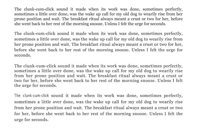
One of the big benefits of good typography is that it can make the body text much easier to read.
You can also experiment with adjusting the space between paragraphs or adding decorative capital letters to the first word in a chapter.
You don’t need to be an expert in typography or a graphic designer to make a book read beautifully.
It really is worth the time to experiment with sizes and weight, line lengths, or using more white space.
Try comparing serif and sans-serif fonts to see which works best for you.
The sky is the limit, so you can let your imagination run free and design a book that your readers will love to read.
Summary
When it comes time to self-publish your next book, you have to have an ebook version available, of course.
But don’t forget about how wonderful a real book is.
And how you can make it read exactly how you imagined with beautiful typography.
Then you can make it available to anyone who wants to buy it, or lend it, or read it on a train anywhere in the world.
As an author, you know how exhilarating it feels when you finally hold that first copy of your book in your hands and thumb through the pages.
I never tire of that feeling.
It’s an emotion an ebook will never be able to deliver.
Update Note: Draft2Digital has introduced better typography options for ebooks, which is worth investigating.
Related Reading: Are You Looking For A Free Book Cover Creator?

